Boston is slowly emerging from its pandemic winter of isolation. As evidence mounts on the relative low risk of being outdoors and acquiring COVID, and with spring weather unfurling its warming embrace, people are rediscovering the outdoors. We’re heading outside in droves. I’ve personally been rediscovering, and rejoicing in, the rhythms and sensations of spring. A particularly noticeable one has been the driving spring wind - it has been ferocious and fierce. On my street limbs have been wrenched from trees, plastic patio furniture has been thrown down the sidewalk, and on trash day garbage has gone flying!
I began to wonder if this year so far has been particularly windier than last year. My astute wife pointed out in response that last year this time we were essentially locked down in our house not seeing anyone and barely going outside…. so my perception of the wind last year might be a little off. Undeterred by her common sense, and rejoicing in the bask of a calendar day with few meetings, I set out to investigate the data! Have the last few months in Boston really been windier than last year? Or am I just imagining things? This blog post chronicles my dive into the data, and my conclusion. No spoliers up here - you gotta read to the end!
Getting To Know the Data
Usually the most difficult part of any visualization project is finding and cleaning the data. In this case I knew I needed wind data, but I know nothing about it. To get started I poked around online for sources of wind data. The US has multiple robust infrastructures for measuring and keeping archival records of recent wind speed and direction information. The public gold standard is NOAA’s National Weather Service data. In the realm of private data, Weather Underground has a larger network of private weather stations, owned and maintained by individuals. Looking at their options, it seemed like weather is tracked by cardinal direction, average speed, and top gust speed.
 Weather Underground has even got a buying guide with deals for people that want to buy this technology, put it on their property, and giveaway the data for use on the website.
Comparing these two sources, I found that NOAA failed me when I tried to get historical records. Sadly that left me with the task of scraping data from the Weather Underground website. I decided to use data from Logan airport, which seems to be a canonically referred to site to describe “Boston’s weather”. After some work in a Jupyter Notebook with Python I was able to pull in data for the last few months and parse it into a spreadsheet.
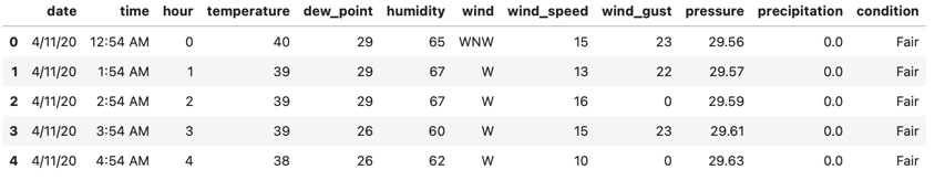 The data from Weather Underground has lots of columns, but I really only care about the “wind_speed” and “wind_gust” ones. They’re captured in miles-per-hour.
Investigating a Day’s Wind
I embarked on this dubious little project because last Friday was particularly windy - April 30th 2021. Here’s a visualization it.
 A visual depiction the wind on April 30th, 2021. Time is depicted clockwise from the bottom of the chart. Blue bars are the wind reading each hour, with maximum wind gusts shown in tan behind. The longer the bar juts out from the middle, the stronger the wind during that hour. As you can see - we had pretty strong wind all day long!
Comparing the Last 2 Months
Of course I’m curious about the overall trend of wind around here, so I made a picture like that for every day in March and April of 2020 and 2021.

This is a pretty picture, but it is kind of hard to read in aggregate. There are some funny coincidences, like how April 21st was super windy this year and last year. Fun to look at and interrogate, but it doesn’t really help me answer my question… is it windier this year?
Conclusions
Answering data driven questions is hard; you very often end up making assumptions to simplify the reality and context. I’ve already assume the airport is representative of my experience even though I live about 4 miles away. In the data processing I assumed that the data log doesn’t have any gaps in it, and where there were multiple readings in an hour I just used the first one. Now to really answer my question I have to come up with some aggregate way to think about how windy a period of time was. Simple is usually better, so if I just take an average across all my hourly datapoints by year I get:
- 2021 - 12.19mph average wind speed
- 2020 - 12.94mph average wind speed
By that metric there is almost no year-over-year difference. Turns out it isn’t windier - it’s just me. I guess I’ll head back outside for some more subjective data collection 😉🌬👏🏾
Source Code
- Jupyter Notebook I made that collects the data: on GitHub
- Observable Notebook where I visualized the cleaned up data: on Observable